


Listening to SaaS product leaders
We love listening to SaaS product leaders, aspiring to do a UX revamp.
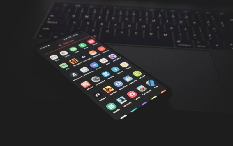
“Why can’t everything just be as simple as a Google search?”
“Why the hell do we still have those overwhelming menus?”
“Why can’t everything just be a simple slack conversation!”
It’s amazing how within a few minutes into the conversation, they would list down 17 quick fixes to eliminate the unnecessary.
I’ve heard some of the most thought-provoking questions from legacy enterprise SaaS companies that have been around for decades, aspiring to modernize their software – but could almost never do it, because thousands of users are habituated to using their product someway.
It’s a hard decision to make. When to sunset the old & embrace the new, especially when the status-quo seems to be working well.
“I want to do something aspirational with AI/ML to simplify the mammoth we have, just don’t know who can intervene & own the journey with us”
Case Study: HR software company
One of my consulting gigs was with an HR software company that takes care of all employee experiences from entry to exit.
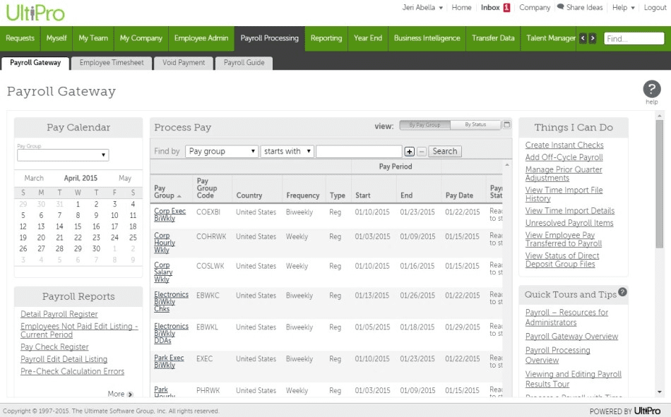
And it looked something like this:
I was going through the product in greater depth, and some of the first thoughts that came to my mind, being a UX person were –
“Why can’t I see what I’m needed to do on priority this week, what I need to delegate or get approved?”
“Why can’t we have a fluid UI, that dynamically arranges my menu based on my recent activity & most frequently accessed features”
“Why can’t we go menuless? Or replace static navigations with dynamic menus, the most frequently accessed module, becoming my home”
“Why can’t we have conversational UI, for simplifying finding information & initiating workflows to get things done”
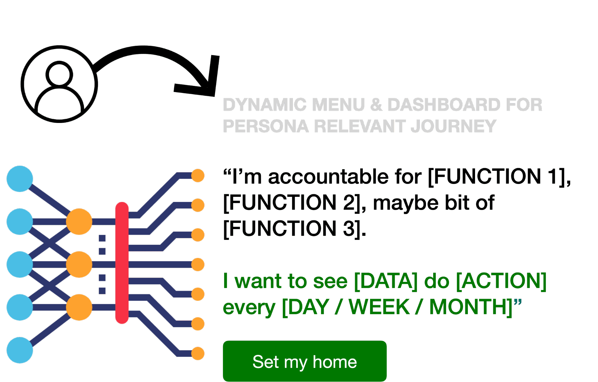
Thinking expansively on these questions, I started drawing a few user personas, who used the product almost on a daily basis, to do their job.
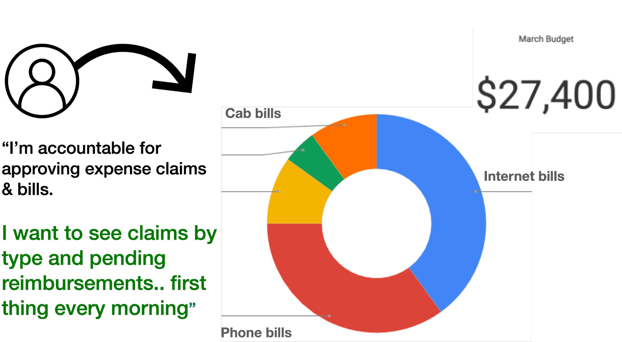
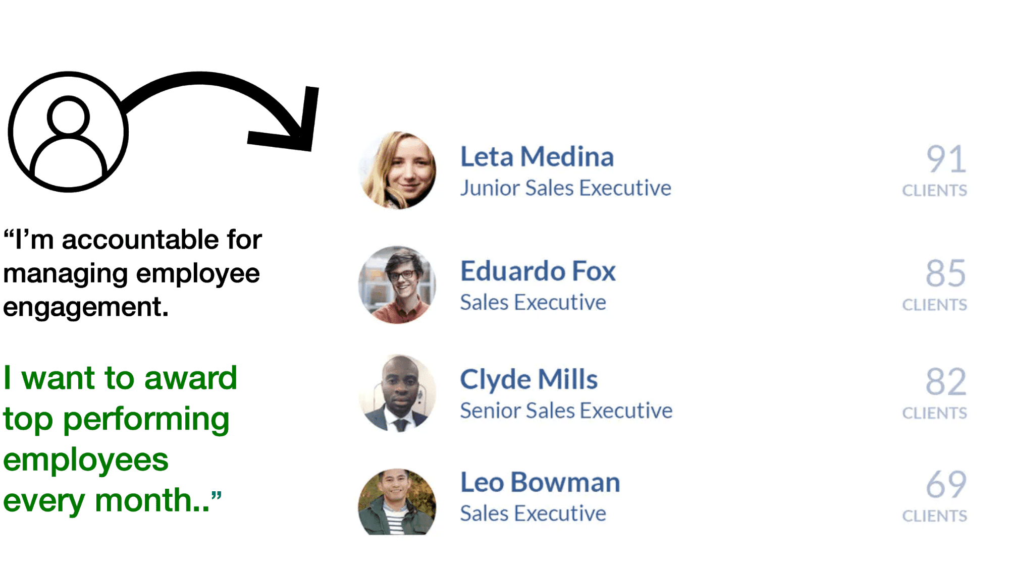
Persona in charge of hiring & exits, persona in charge of expenditure reimbursements, persona in charge of employee engagement.
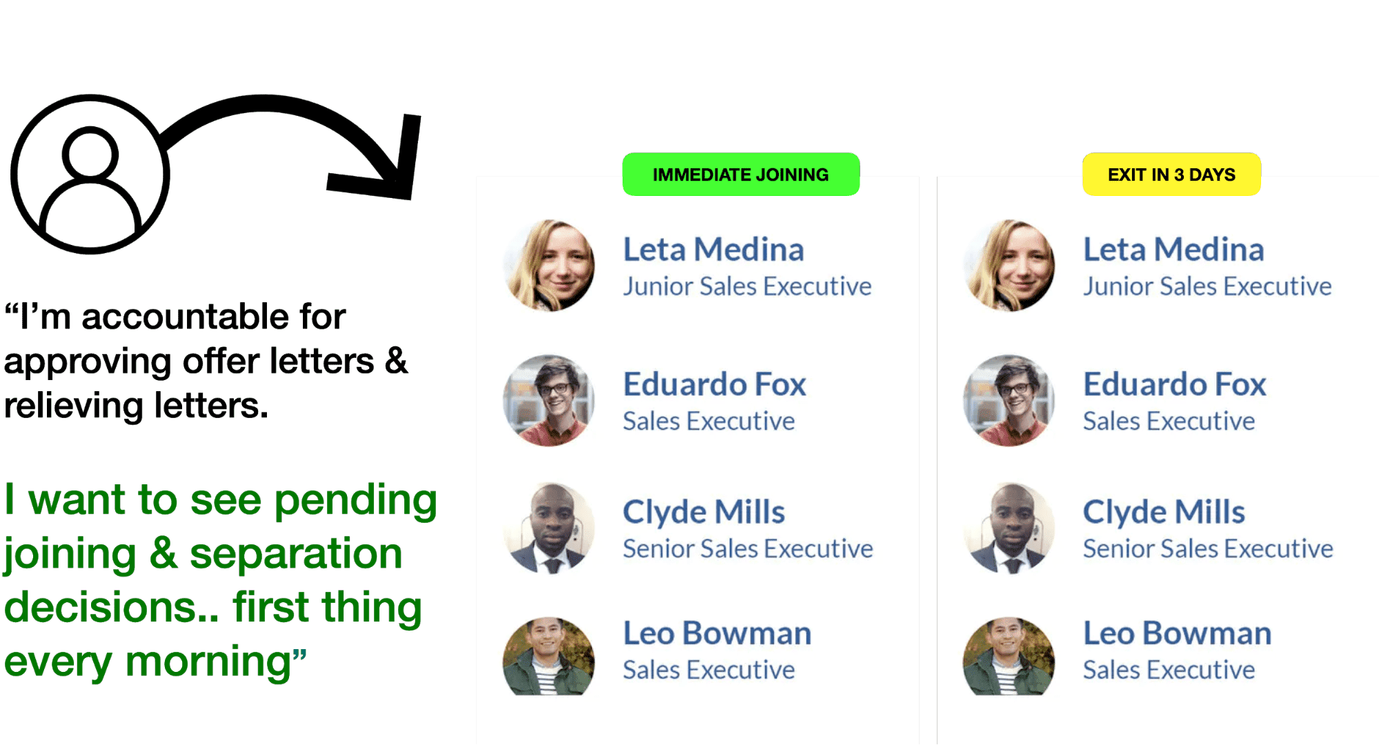
User persona: Hiring & relieving
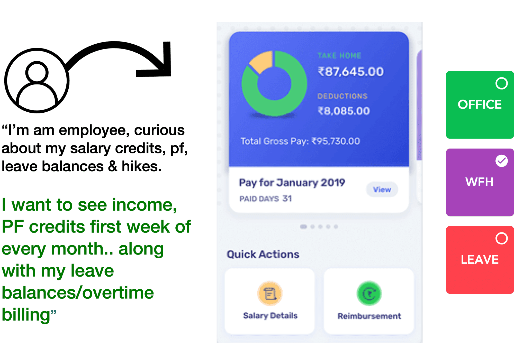
And the most important user – the employee.
I was imagining an anxious employee, waiting to see payslips, PF money, vacation balances & overtime compensation.
The more I did the personas & empathized with these characters, the easier it got for me to imagine a solution – that made everyone’s life easier.
One menu fits all – is dead.
What if HR admins got to simplify their work, by just configuring the system to how they want to use it?
Take that idea to the next level
What if AI/ML can learn user’s preferences and listen closely to what they’re actually doing on a daily basis – to reconstruct the UI they see every day?
Persona, Intent, Habit based UI:
Dynamically rendering Content, Actions, Flows.
I love asking these “What if” questions – that stretch all of our thoughts, to imagine new possibilities.
I then started creating a few slides for my presentation to the client, listing down recommendations & approaches:
- Fluid, conversational UI instead of static navigation
- Frequently accessed becomes first menu
- Simple, minimal on the outside – sophisticated inside
- Repeated actions can become main menu (ML)
- Actions can be instant or scheduled (ML based prompts)
- Enterprise level configs / rules can be set for flexible UX
- Look ups, finding actions can be voice command driven
- Data charts can be served to a voice command / mobile friendly
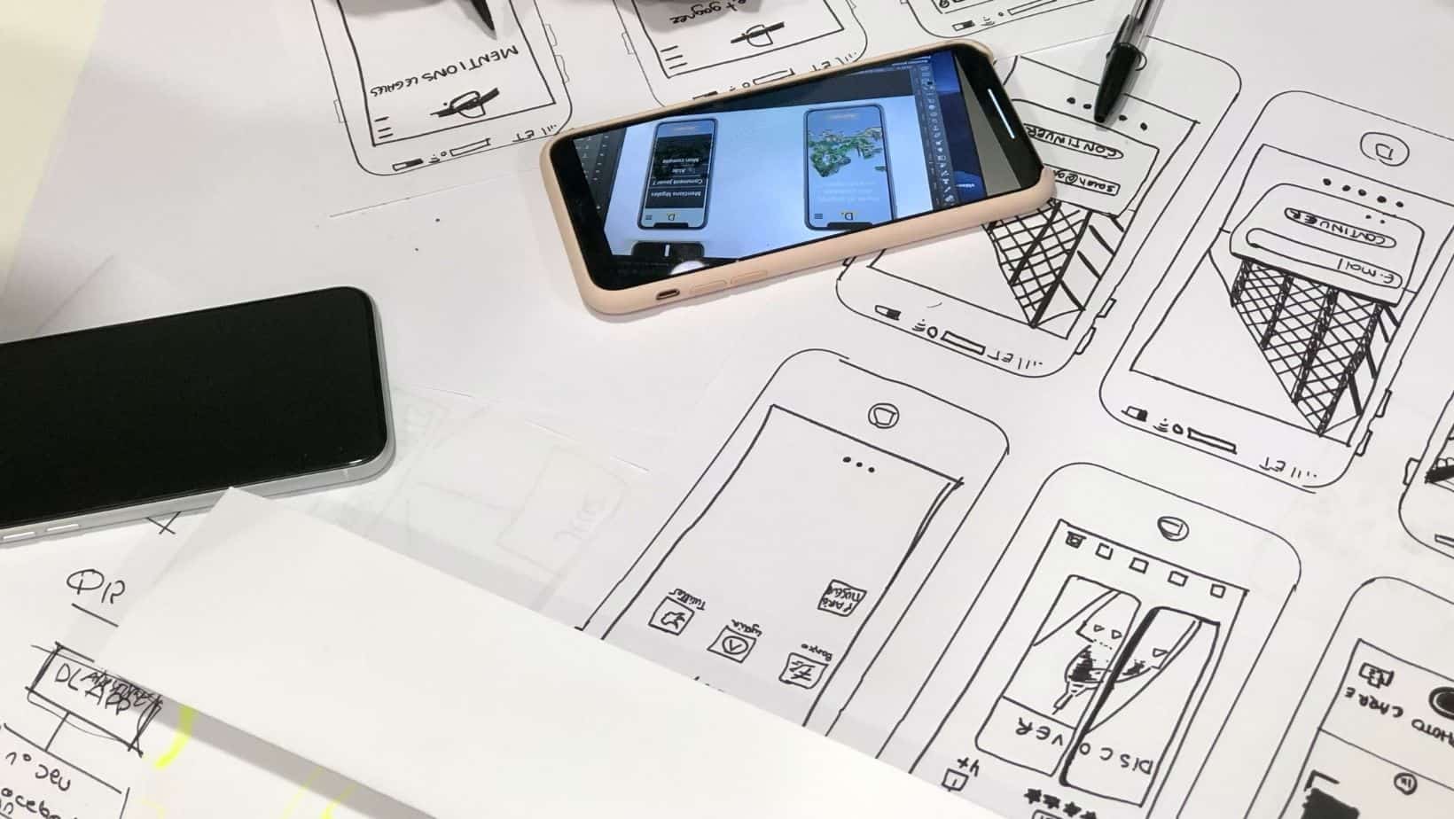
I also tried sketching a wireframe, to put all of these ideas into motion and trying to visually communicate the power of AI-enabled dynamism, on a single screen.
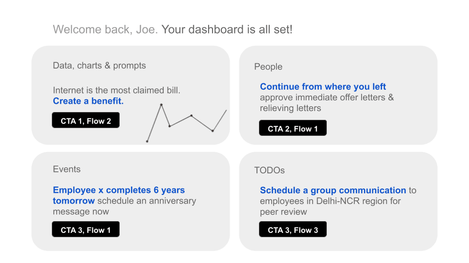
I was also fascinated with this idea of AIML enabled Assistive UI, which makes life a lot simpler for workflow-based apps, requiring follow-ups, calendar events, reminders, TODOs, Triage sheets, etc.
I was ready for the presentation. And the client loved the approach we suggested.
Some things that really created value for this aging SaaS:
- Dynamic, fluid UI that makes UX very personal & habit aware
- Bold, intentional, minimal UI that reduces cognitive load by simplifying prioritization of actions.
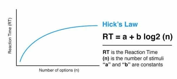
Hick’s law suggests more things you eliminate, higher the productivity.
- Simple, Clear, Conversational messaging & interactions
When the UX is nailed, UI design becomes a lot simpler. It then is pretty much a matter of choosing the right design system, creating a design language, brand persona, moodboard and freezing on the tonality of content.
Bold, Visual, Intentional UI
- Custom design language: Using shapes, color, symbols, motion graphics & fonts
- Meaningful motion graphic/micro-interaction to acknowledge actions with animated responses/feedback
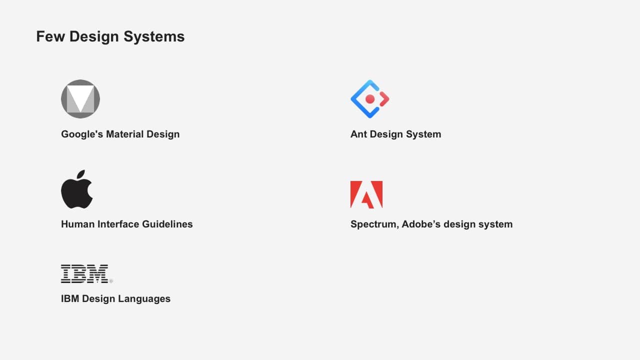
Some of the design systems we suggest:
We hope you found this UX insight helpful.
Contact me to discuss how Codewave’s design-led intervention can help you grow your business. I’m reachable at hello@codewave.com.